Coronavirus Statistics Dashboard
Introduction
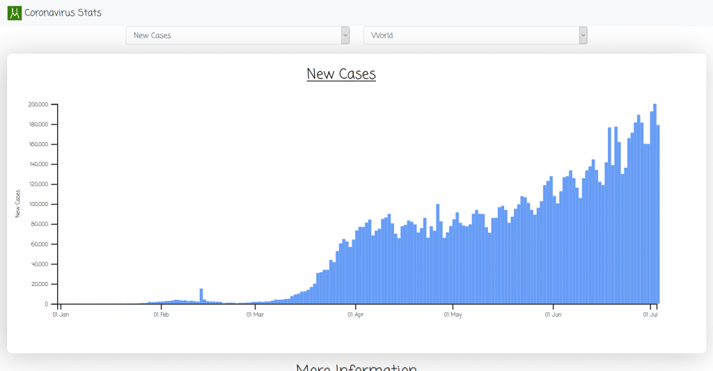
Last week I set out to create a visual dashboard of Coronavirus statistics. I wanted to create a simple dashboard where a user can view statistics for every country in relation to the current on going Coronavirus pandemic.
Having recently learned d3.js, I put my newly acquired skills to the test.
The dashboard consists of four (4) displays:
- Bar graph – Displays various statistics against time. These various stats are: new cases(cases per day), new deaths(deaths per day), new tests(tests per day), total cases(cumulative cases), total tests(cumulative tests) and total deaths(cumulative deaths).
- General Information – Displays general statistics about a country such as median age, population, diabetes prevalence, percentage of people 65 years and older, etc.
- Donut graph – Displays the smokers’ distribution according to gender in the selected country.
- About – Contains short paragraphs explaining the sources of data and how to use the dashboard.


How to Use the Dashboard
The dashboard is pretty straightforward to use.
There are two selectors at the top of the page.
- Statistics selector – Select the kind of statistics you want to view on the bar graph.
- Country selector – Select the country whose statistics you want to view.
Changing the country will also affect the values on the general information and smokers’ distribution displays.
Source Code
As I mentioned earlier, I am using d3.js to create the visualisations(bar and donut charts). Besides that, I’m using jQuery/JavaScript to handle events on the dashboard.
Important files:
- Main.js : Is the controller file. Here we declare global variables and functions, load our data, initialize graphs and do event handling.
- Bar.js : Contains the class definition of our bar chart.
- Pie.js : Contains the class definition of our smokers’ distribution donut chart.
The basic structure of our visualizations’ classes:
- constructor – Create the visualization instance by passing the id of the parent element.
- initializeChart() – Define static properties of the chart such as dimensions, margins and axes.
- wrangleData() – Do any data manipulation necessary to display the visualization.
- UpdateChart() – The D3 update pattern goes here.
Future Improvements
I look to add a timeline visualization to display how different countries faired against each other in the course of time and also choropleth graphs.
Big thanks to Our World In Data for scraping and providing the data.
Website: coronavirus.hmwawuda.com
GitHub repo: Hammy25/Coronavirus-Dashboard